Thursday, 22 January 2015

Experimenting with editing techniques - digipak progress update
Experimenting with editing techniques
I felt like my images were fairly bland, due to me not knowing how to use Photoshop - subsequently resulting in a lack of editing done to my images. Now that I am more confident with using Photoshop and its various tools, I have decided to edit my images in a variety of ways to see which I like best. Upon referral to my research into indie digipaks, often a 'vintage'/'retro' look is added to the images. For example, on Mumford and Sons digipak for 'Sigh No More' an almost old-style effect has been added:

A vintage effect is also featured on indie band Two Door Cinema Clubs digipak front cover for 'Tourist History':

And again on Vampire Weekend:

Therefore, I have tried to emulate this in my own print work. I have created both a subtle and bold version of the vintage effect on the front cover of my digipak image.
Here is the more bold version of my front cover image. It creates an old, vintage style to my digipak.

However, I don't feel as though these images work too well in regards to the indie genre, as they are perhaps too heavily edited.

Therefore, I decided to begin editing a more subtle vintage style of image.
Here is a before and after of my edited front cover digipak image:

I achieved this much more subtle vintage look by adding three adjustment layers, levels, black and white and gradient, where by I manipulated the colours featured in the image. I heightened the yellows and reds in the image and decreased the greens and blues, lowering the opacity at the same time, which has created a more washed-out look to the image. I then proceeded to add the artists name and album title. I have been experimenting with various fonts to use for the album title, but I have decided on this one which I downloaded from 'DaFont':

I chose this font as not only is it bold enough to stand out, but it also has a handwritten feel to it which I think works well with the indie genre.

After this, I decided to edit all four of my images in this 'vintage' style format.


I also resolved the issue of my squashed images as mentioned in my class feedback, by cutting and re-sizing them.
Here is a comparison between my non-edited images and my edited images:

I still feel that I may need to edit my digipak images further to cohere with my print advert.
Wednesday, 21 January 2015

Tuesday, 20 January 2015
Monday, 19 January 2015
Video of the week
My video of the week is by Hozier - Take Me To Church. I like the video as it's entirely in black and white and has a story to it.
Friday, 16 January 2015
Thursday, 15 January 2015
Time Management Update - Editing Process / Print Advert Update
After finishing our final cut, I have spent the majority of this week beginning to choose and edit photos for my digipak and print advert. Thus far, I have chosen a selection of images from my photoshoot which I believe will enable me to create a professional looking digipak and print advert. I have chosen to create a four panel digipak. At this current point in time, I have chosen these images:
Front Cover of digipak:

Behind CD of digipak:

Top left of Digipak:

Bottom left of digipak:

Print advert image:

I have chosen this image for my digipak as Hollie is not looking directly into the camera, which creates a mysterious and solemn vibe to the print advert. Also, as it is landscape it is more suitable for an unsigned, indie artist - as from my research it was clear that unsigned, less established artists often had smaller print adverts, for instance in a magazine.
Editing
I have been using Photoshop in order to edit and place my images onto my digipak template. From my research I noticed that a lot of indie artists used white font, often written in almost an informal, handwritten type of font, therefore I have replicated this on my own digipak.
My front cover for my digipak so far:

The font I have used is called 'Jenna Sue' which I downloaded from this website: http://www.dafont.com/
I really like this font as I feel that it coheres with the indie genre, the handwritten style creates an informality and is relatable for the audience, almost looking like a signature which brings the audience closer to the artist. I had originally wanted the text to be placed on the bottom right hand side, however due to Hollie's white jumper it was not clear to read.
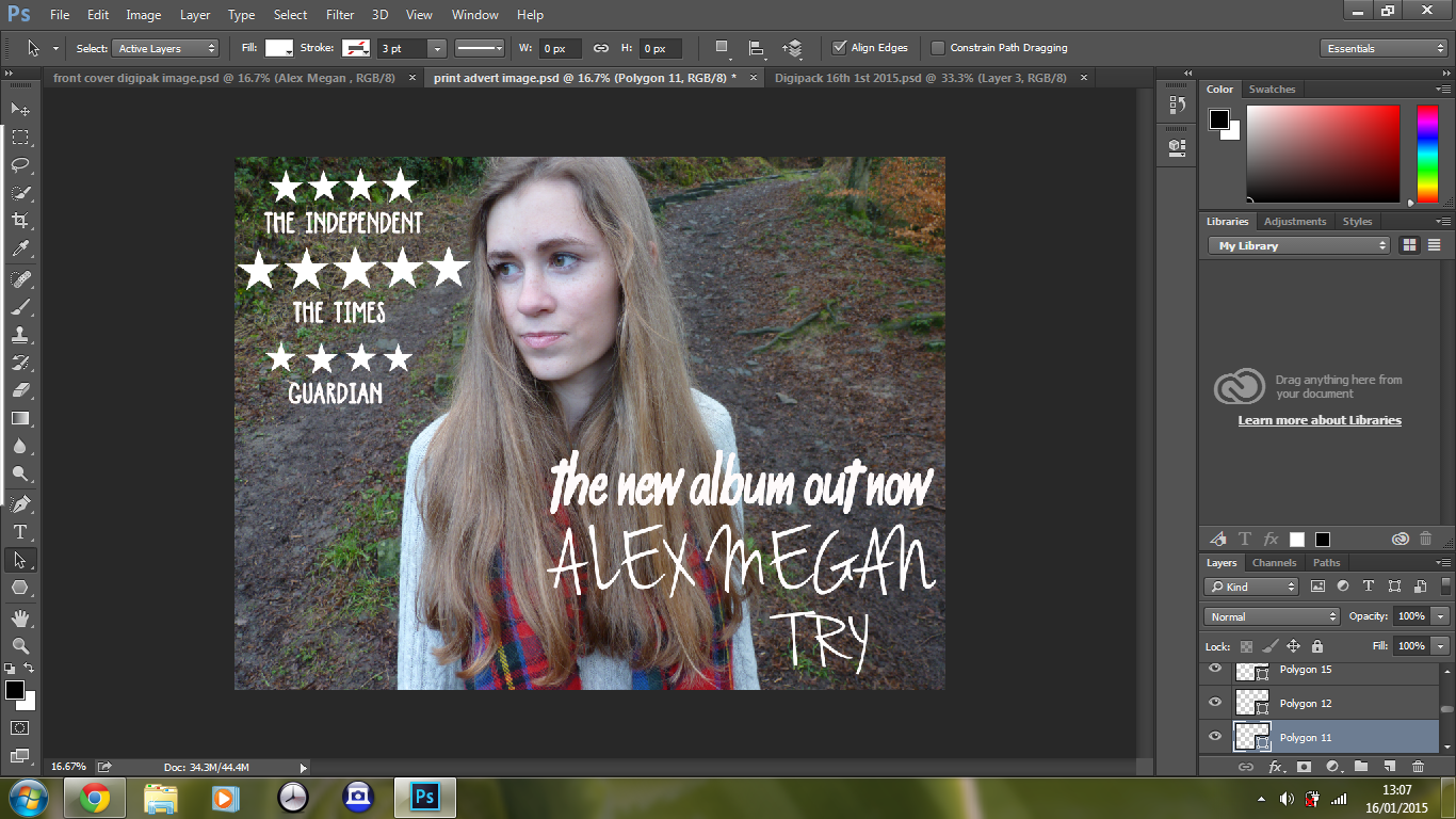
In addition to this, to create continuity between my digipak and print advert I have used the same font, location and clothing on my print advert:

I have used a much bolder, capitalized font for the reviews of the Digipak and artist on my print advert as these stand out and I have noticed from my research into print adverts that this is because it is an important aspect of a print advert, as it sells the album and emphasises how good the artist is. I have used this font for the reviews:


This is what I have so thus far:
Subscribe to:
Posts (Atom)