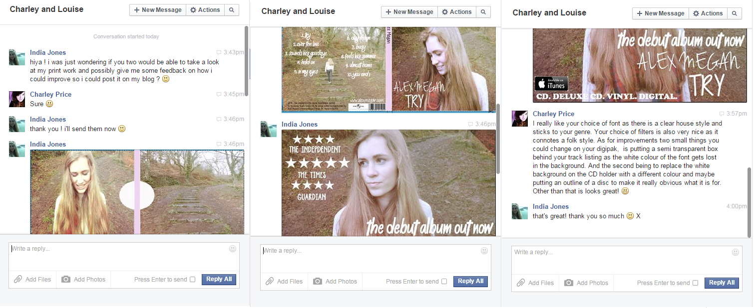
In addition to my video target audience feedback from Rosie and Hollie, I decided to also gain some feedback from Charley and Louise via Facebook. I did this as I wanted to gain a better and more thorough understanding of how I can improve my print work, and ensure I create a realistic promotional package. Here is the feedback I received from Charley:
I completely
agree with
Charley's feedback in terms of the way in which I could
improve my print work. Therefore, I will aim to try and ensure the song titles on my digipak are
clear and readable, e.g like
Charley said, perhaps by experimenting with adding a
transparent box behind the titles. Also, I agree with the need to get rid of the
white background and drawing an outline of a
CD to ensure it is
clear what is meant to be there.
Here is the
feedback I received from
Louise:
I also agree with
Louise's feedback - that I need to get rid of the
blue template behind my digipak, and also, as
Charley mentioned, create an
outline of a
CD to ensure it is
clear what is meant to be there.