After finishing our final cut, I have spent the majority of this week beginning to choose and edit photos for my digipak and print advert. Thus far, I have chosen a selection of images from my photoshoot which I believe will enable me to create a professional looking digipak and print advert. I have chosen to create a four panel digipak. At this current point in time, I have chosen these images:
Front Cover of digipak:

Behind CD of digipak:

Top left of Digipak:

Bottom left of digipak:

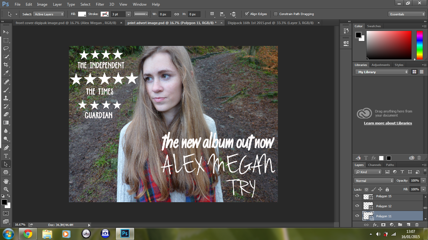
Print advert image:

I have chosen this image for my digipak as Hollie is not looking directly into the camera, which creates a mysterious and solemn vibe to the print advert. Also, as it is landscape it is more suitable for an unsigned, indie artist - as from my research it was clear that unsigned, less established artists often had smaller print adverts, for instance in a magazine.
Editing
I have been using Photoshop in order to edit and place my images onto my digipak template. From my research I noticed that a lot of indie artists used white font, often written in almost an informal, handwritten type of font, therefore I have replicated this on my own digipak.
My front cover for my digipak so far:

The font I have used is called 'Jenna Sue' which I downloaded from this website: http://www.dafont.com/
I really like this font as I feel that it coheres with the indie genre, the handwritten style creates an informality and is relatable for the audience, almost looking like a signature which brings the audience closer to the artist. I had originally wanted the text to be placed on the bottom right hand side, however due to Hollie's white jumper it was not clear to read.
In addition to this, to create continuity between my digipak and print advert I have used the same font, location and clothing on my print advert:

I have used a much bolder, capitalized font for the reviews of the Digipak and artist on my print advert as these stand out and I have noticed from my research into print adverts that this is because it is an important aspect of a print advert, as it sells the album and emphasises how good the artist is. I have used this font for the reviews:


This is what I have so thus far:
No comments:
Post a Comment